
If your Apple ads are on fire, it might not be your doing.
A small change in the interface can go a long way.

If you get an ad served in an ad-supported iPhone app, after a lesson or a mission, there are basically two things you can do: interact with the ad, or wait out a grace period, then skip the ad.
Or at least, that’s how it used to work.
In-App ads can be a great way to help reach your marketing goals. Like any type of advertising they have their pros and cons, of course. In my opinion, and generally speaking, they’re a great tool for awareness. You have the attention of the users, you can use the full screen of their phones; and since they have to wait a little bit before they can skip your ad there’s a window to feed them a message.
An awareness campaign measured as a performance one
However, in a world becoming more performance-minded every day, it helps if you can back up your awareness objective with some “results”. The main result in an awareness campaign should be something like: does my ad reach the right audience? Do people understand what I’m trying to tell them? And is this interesting for them so they might consider buying my product or service.
Here worlds collide.
For starters, you’re advertising in a digital reality, probably using tools that allow you to target in some real-time-buying fashion. So while the ad itself screams “awareness”, the practice of booking the ad (and the people booking it) screams “performance”. So no doubt in-app campaigns are funded with performance budgets.
As said, there are some metrics we’d like to measure in an awareness campaign, but these metrics aren’t that easy to measure. But the performance context outlined above requires quick and easy metrics to justify the money spent. So tech does what tech does best: give marketers the numbers they want, not those they need to make the right decisions.
Tech does what tech does best: give marketers the numbers they want, not those they need.
After all it’s easier to tell them: “yes dear marketer, your campaign is performing very well”; than “well actually, you shouldn’t look at it this way“.
Small change.
So what changed?
First a bit of mechanics of how in-app ads are integrated in all kinds of free and freemium apps. If you pass a level, finish a challenge or whatever, and it’s time for an ad break, you will be served a mobile ad. Full screen.
Normally, after a few seconds a close button appears. If you click it, the ad is gone. Sometimes you are served one last frame, that you can close accordingly. But the mechanic is very clear: wait a bit so the advertiser can use some of your attention, then you can close. This also works with power-ups, but then the wait is typically a bit longer: if you watch the ad for at least 30 seconds, you get a reward. If you close sooner, no reward. In the meantime, before closing, you can of course click (or tap) the ad and open a landing page.
This click is important. A click is a performance metric, at least it shows interest.
Or does it?
Because that’s what changed. Up until recently you had to bide your time, wait for the close button which was a clear X before you could close the ad. And since forever there have been bad implementations of this button, accidentally triggering a click. The so called fat-finger clicks. But that’s not the point of this article, because something more fundamental changed: the close button is now preceded by an arrow, and it appears way before the close button. If you click the arrow, you trigger a click
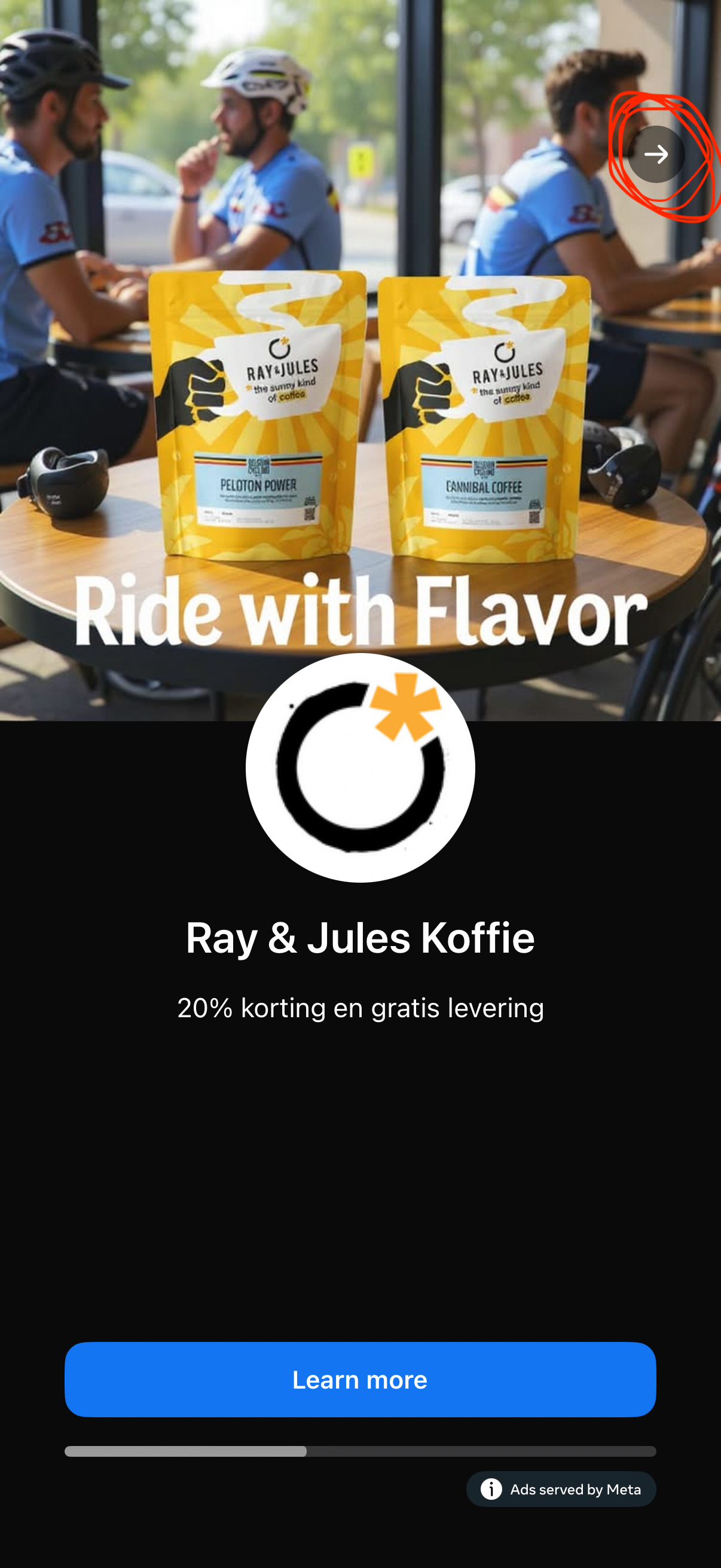
The image above shows the arrow I mentioned. If you click it, the website opens as shown on the image below.

The reason I noticed is that I was ending up on the websites of the advertisers the whole time, while before it was only now and then. To be clear, there is no reason whatsoever to implement the arrow “button”, because the whole ad is a button that leads to the website, except for the close button, that appears after a while, and that looks like this:

Big impact.
Five seconds of attention traded for fiddling around with unwanted pages doesn’t sound like a win to me.
A change that is hardly noticeable, but the impact is big nonetheless. Suddenly these in-App ads drive a lot of traffic. Yes, worthless traffic with a very high bounce rate, but that’s for another discussion. Marketers will claim at least people are interested. They will argue the ads work because people click.
In reality they work less, because instead of five seconds undivided attention users end up in a technical mess, with pages opening they would like to close by the time the ad can be skipped.
Five seconds of attention traded for fiddling around with unwanted pages, and less attention for the ad, doesn’t sound like a win to me.
To be honest, I’m not sure what genius came up with this change, but I’m sure their boss is very happy.
Is this an Apple implementation? Is the same going on on Android? Is this done by AdMob from Google? Or is it Meta, that apparently served the ad in my example. I can’t tell. But it doesn’t make a difference really, because they all win while we lose.
If your mobile ads are suddenly on fire, it might not be your merit.
I’m Steven. I write about advertising and technology. I lead AdSomeNoise, a new breed of full-service advertising agency with a digital core, based in Europe and operating globally. I’d love to get in touch.